Redesign of Internal CRM Tool
As a Senior Designer for Files.com I was tasked with updating the interface and improving the usability of our internal CRM tool.
Working as a project lead with a developer, and a product owner, this project required:
Definition of user roles
Contextual interviews
Mapping user journeys
Site maps/information architecture
Heuristic Evaluation
UI/UX redesign through:
High fidelity mockups
Common component library
Coordinate with backend developer to make data and logic changes in Ruby
Implementation of mockups in the codebase, via HAML and SCSS files
Discovery Phase
During the discovery phase, I set out to understand the work that had already been done in this tool by:
Defining the 3 types of user roles who use the CRM
Running contextual interviews with each type of user.
Mapping the user journeys while documenting the information architecture.
Doing a heuristic evaluation to determine major areas of improvement.


Design
With the major points of friction identified, I set out to establish a series of reusable UI patterns, that would:
Modernize and standardize the look and feel of the whole app.
Be flexible enough to address the identified areas of improvement and adapt as new features are added to the platform.
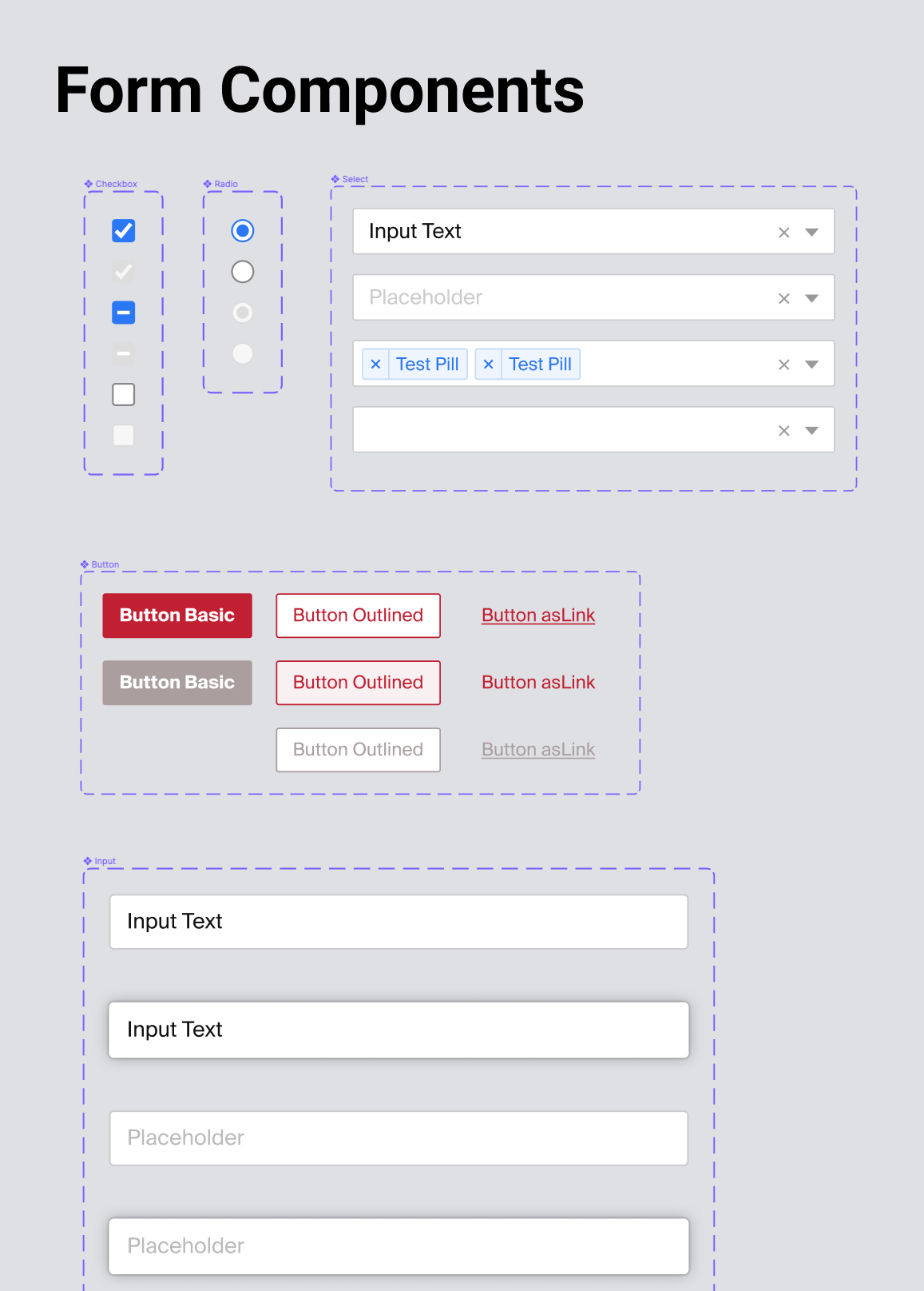
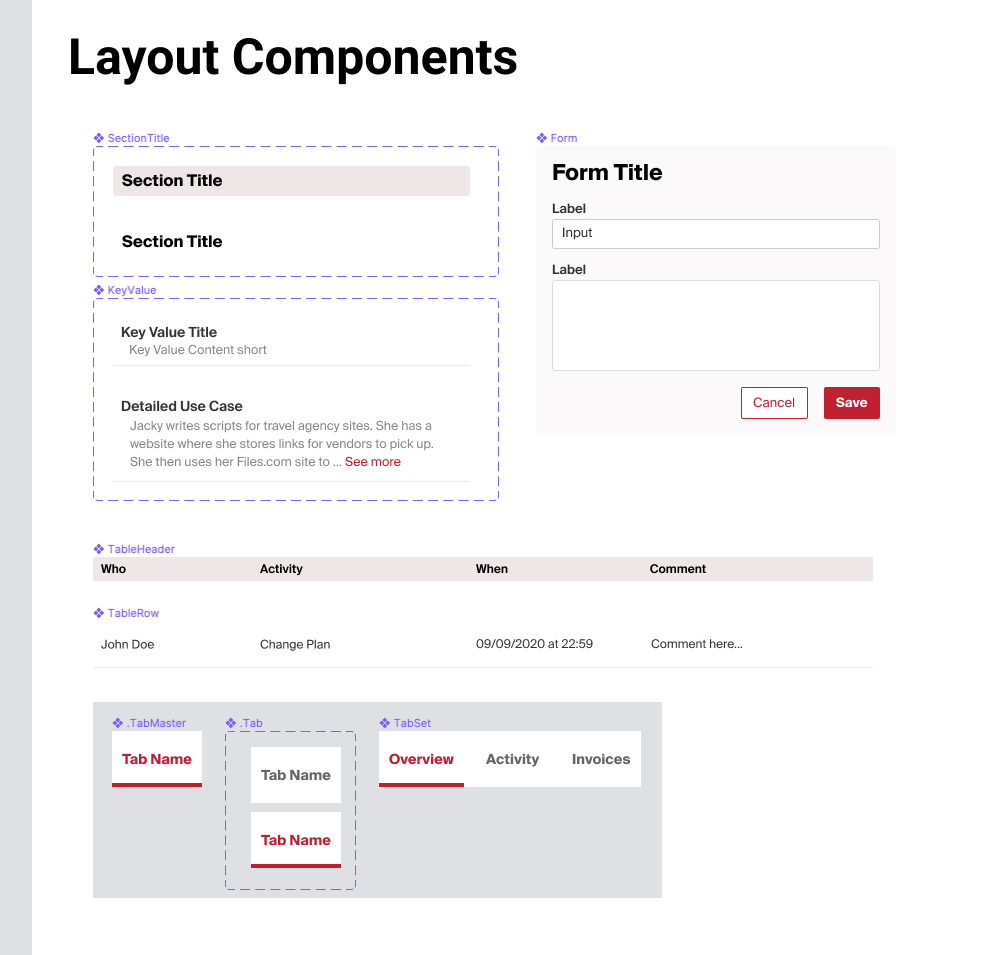
Once the new UI patterns were established, I assembled a series of high fidelity mockups to present and discuss with shareholders.


Development
With the mockups approved, I started coding the designs into the existing HAML and SCSS platform.
Through close coordination with the project’s backend developer, we implemented the redesign in a staging environment that stakeholders could test and give feedback, before releasing it live.
Release and User Feedback
After multiple weeks of work and revisions, we released the 1st stage of the updated CRM. Response from users was overwhelmingly positive, with the following highlights:
Users reported that they felt listened to and that their feedback mattered.
A new feedback loop was established so feature requests could be evaluated and worked on in a more streamlined manner.
The use of reusable UI components drastically simplifies the process of adding new sections and or editing existing ones.